Healthy shopping app
Senior UX / UI & IxD Designer, Business Analyst
Challenges
The association of Nutritionists wanted to develop an application to help people with specific health issues (high blood pressure, allergies, heart disease, etc.) to make their grocery shopping and dining out easily.
A scanning function would help choose the appropriate product according to their regiment while shopping.
Some key issues needed to be addressed first:
-
How collect data on the mindset of our target users.
-
Ensure that both the grocery shopping and the dining out at restaurant was covered even though the potential functionalities were quite different.
-
Ensure a way of validating the information provided on the products.
Inception
This project was executed in a start up mode. As a Senior UX my responsibilities included to create a team of UI, Front-end, Data Analyst and Tester.
Overview with the management team on the budget aspect of the project and Evangilise the stakeholders and the collaborators about UX.
With the help of the marketing department, we did a competitive analysis in order to understand the product landscape. We identified 3 main competitive products
and issued :
-
the basic requirements
-
ideas for value added features
-
functionalities issues to avoid

The second step was to gather data. We had access to a large number of nutritionist and their customer base.
We were able to find a good number (77) of voluntary participants. We first established 4 personas.

Persona flash card
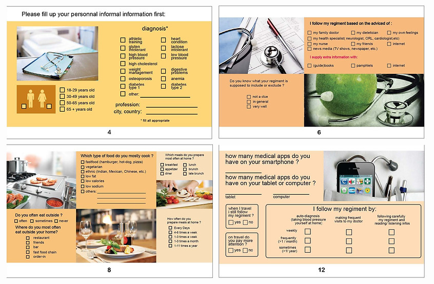
We elected the Culture Probe method as our volunteers saw their nutritionists on a regular basis (biweekly or weekly).
A survey was designed to help the volunteers easily provide information.

Culture probe forms
Conception
From the gathered data we extracted a list of requirements including key features for the product backlog.
We established user stories and ensured to cover all functionalities and features.

User Flow for new product
With the front-end developers we created the provisional sitemap. In collaboration with the product owner we started to prioritise all features.
We used them with functionalities to established their co-dependencies (parent-child).

Provisional Sitemap
Interaction Design
First the application architecture was established, then the users' interactions
and the application behavior was defined.
Working in an agile mode, we iterated until the wireframes reached consensus.

Interaction Design analysis using Wireframes
We created an interactive prototype with justinmind in order to test our proposed solution with our volunteers.
Again using iterative design, we tested and review our concept until it was judge fitted by the marketing team for the market.
The last step was to collaborate with the UI Designer to establish a Design system cohesive with stakeholders and UX goals. Mid-level wireframes, illustrated below, were provided to ensure the alignement.

Prototyping using JustinMind app

Provisional mock ups for the UI Designer